Buttons
Buttons allow users to take actions, and make choices, with a single tap. Button is basicly a Touchable component I customized
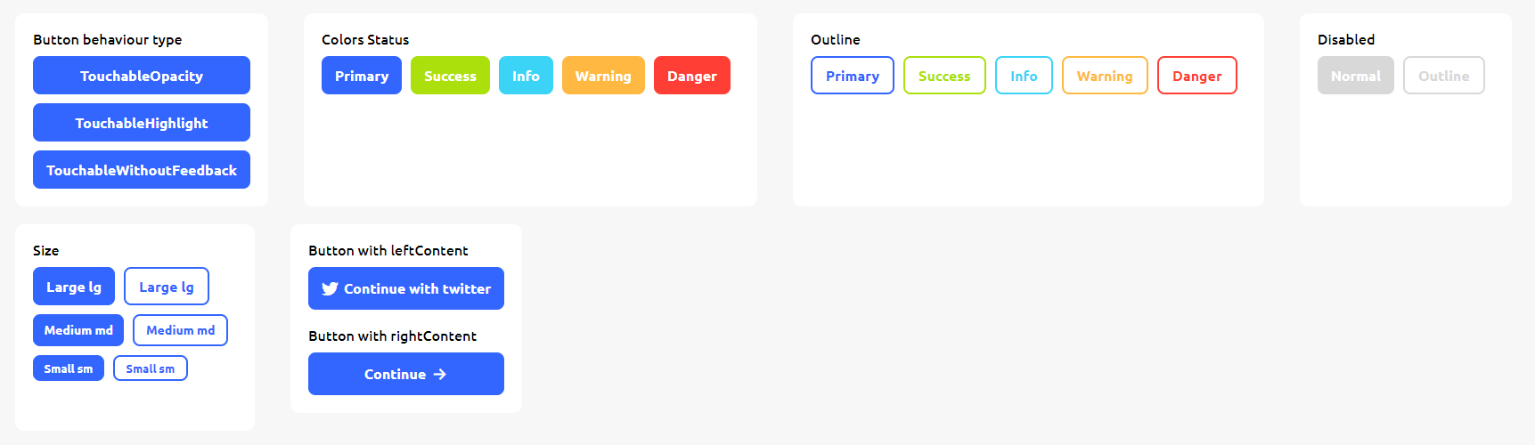
<Button/> have three behaviour :
TouchableOpacityTouchableHighlightTouchableWithoutFeedback
Usage#
Simple Usage#
The default behaviour of Button is TouchableOpacity

If the parent component of the button have flexDirection:'column' the button width will have follow the parent component
Button Color Status#

Outline Button#

Button Size#

With Left or Right Content#
You can fill the left or right side of the text with components. ex:Icons or Image

Properties#
| props | required | value | Default Value |
|---|---|---|---|
| TouchableWithoutFeedbackProps | |||
| type The Touchable behaviour | No | TouchableOpacity TouchableHighlight TouchableWithoutFeedback | TouchableOpacity |
| text | No | string | null |
| color The primary color of the button | No | string | #3366FF |
| inverseColor The secondary color of the button | No | string | #FFFFFF |
| status You can set the color button from this prop | No | primary success warning info danger | |
| outline | No | boolean | false |
| outlineWidth | No | number | 2 |
| leftContent | No | React.Node | |
| rightContent | No | React.Node | |
| size | No | lg md sm | lg |
| disabled | No | boolean | false |
| width | No | number If the parent component have flexDirection:'row' the width of the button will follow the text | |
| textStyle | No | TextStyle | |
| style | No | ViewStyle |