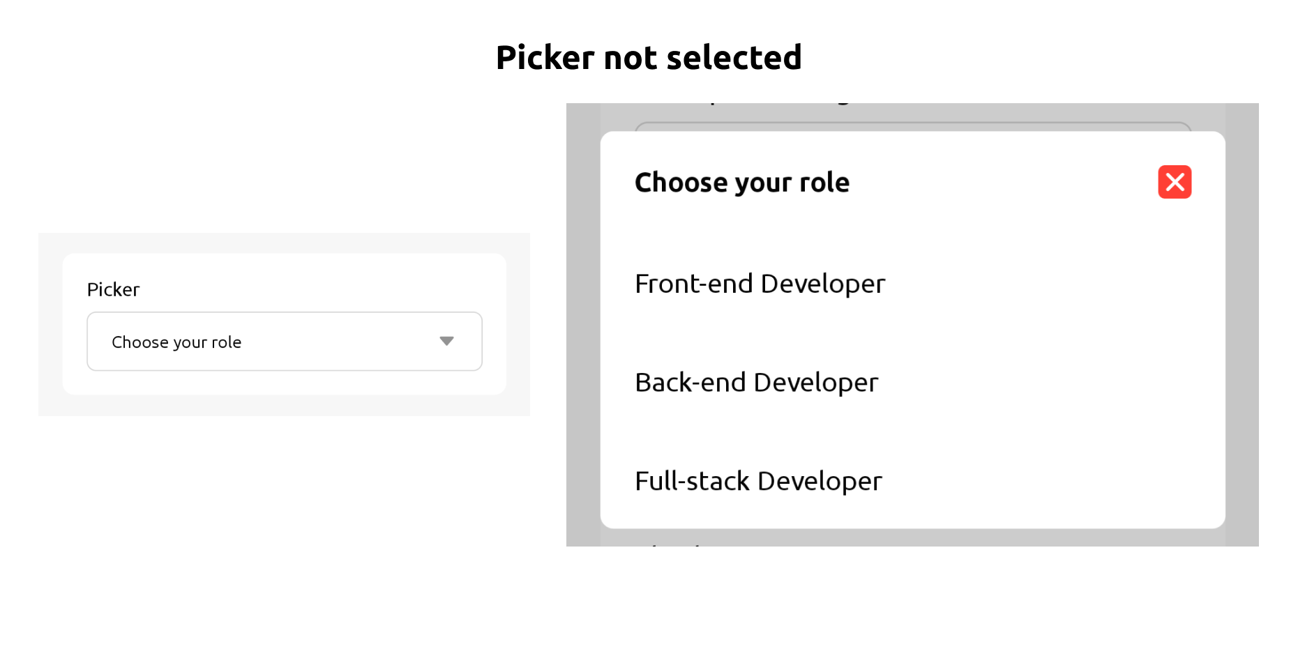
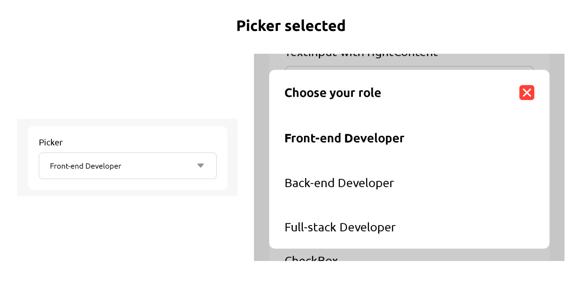
Picker
Picker is a modal with options that you can choose 1 selection
Usage#
Properties#
| props | required | value | Default Value |
|---|---|---|---|
| placeholder | Yes | string | |
| value | Yes | string null | false |
| onValueChange | Yes | (newValue: string) => void | null) => void` |
| items | Yes | [{label: string, value: string}] | |
| disabled | No | boolean | false |
| backgroundColor | No | string | #ffffff |
| borderColor | No | string | #d8d8d8 |
| borderWidth | No | number | 1 |
| borderRadius | No | number | 8 |
| selectionBackgroundColor | No | string | #ffffff |
| selectionBorderRadius | No | number | 8` |
| iconColor | No | string | #939393 |
| labelColor | No | string | #000000 |
| closeIconColor | No | string | #FF3F35 |
| labelSize | No | h1 h2 h3 xl lg md sm | lg |
| placeholderSize | No | h1 h2 h3 xl lg md sm | md |
| placeholderColor | No | string | #939393 |