import { View } from 'react-native';
import { TextInput, Text } from 'react-native-rapi-ui';
import { Ionicons } from '@expo/vector-icons';
const Forms = () => {
const [pass, setPass] = React.useState('');
const [email, setEmail] = React.useState('');
return (
<>
<View>
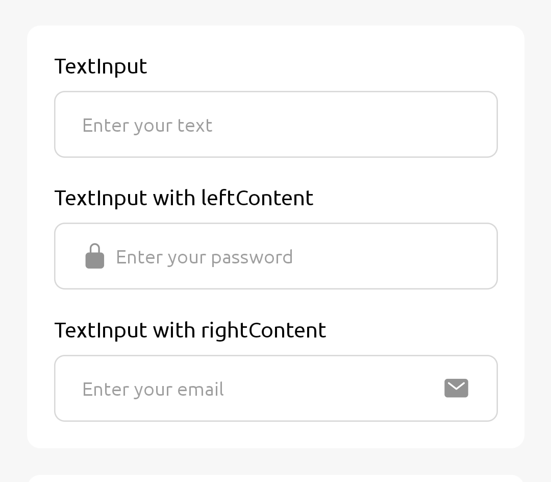
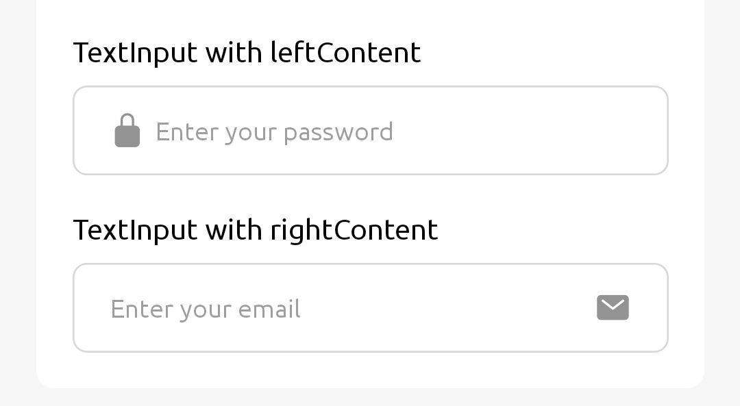
<Text style={{ marginBottom: 10 }}>TextInput with leftContent</Text>
<TextInput
placeholder="Enter your password"
value={pass}
onChangeText={(val) => setPass(val)}
leftContent={
<Ionicons name="lock-closed" size={20} color={theme.gray300} />
}
/>
</View>
<View>
<Text style={{ marginBottom: 10 }}>TextInput with rightContent</Text>
<TextInput
placeholder="Enter your email"
value={email}
onChangeText={(val) => setEmail(val)}
rightContent={
<Ionicons name="mail" size={20} color={theme.gray300} />
}
/>
</View>
</>
);
};
export default Forms;